


Jun 23, 2016
“How to successfully implement an idea?”
-
Vladimir Ivankin ,
Photostock
If you have read the previous post about the use of lettering in pictures, then you'd be interested in how to make your work commercially successful. Today we'll talk about how I see my work, how to approach the creation process and some ways of implementing your ideas.
Looking ahead, I would like to mention that to implement an idea you need to consider many factors that will help your picture become really cool.
The first, and probably the main factor is, of course, out of the box thinking. It's typical for top works to possess a new deep meaning which can be understood quite easily. A good picture is one that due to its precise composition and graphics it is perceived by a person as a whole regardless of his experience and condition at the moment. We won't delve into psychology of visual perception, as it is a separate complex topic and requires sufficient knowledge. You can do without deep knowledge in this area, it is sufficient to comply with some rules for creating balanced pictures. Many authors do this intuitively, perhaps not even knowing how it works.
After an idea comes to mind, one of the main things that I check is its repetition. I'm starting to look how it had been implemented before me, and this is a very important step. Before I used to immediately start bringing the idea to life, whilst now I always have a look at what has been done in this direction – this approach will allow you to improve whatever you have in mind, or it allows you to use your time and energy effectively and change your mind about bringing the idea to life.
What is to be done if there are no ideas and nothing to be inspired by? Actually, stock editors meet contributors halfway and often publish topics, illustrations for which they would like to see. You can track what a stock site is interested in, if you plan to work with a specific agency. The stock photo agency Stocksy, for example, where our studio operates, suggests focusing on their Pinterest, where editors gather their favourite images, photos, ideas for photo shoots. From the moment an idea appears and until its implementation it is very important to remember that your image should be easy to use in design. Ask yourself where you would be able to use it. An article in a magazine? Advertising double-page spread or back cover of a book? If the future picture is suitable - good, if it is convenient for use in different designs and in different areas - great! Then you can safely proceed to its implementation.
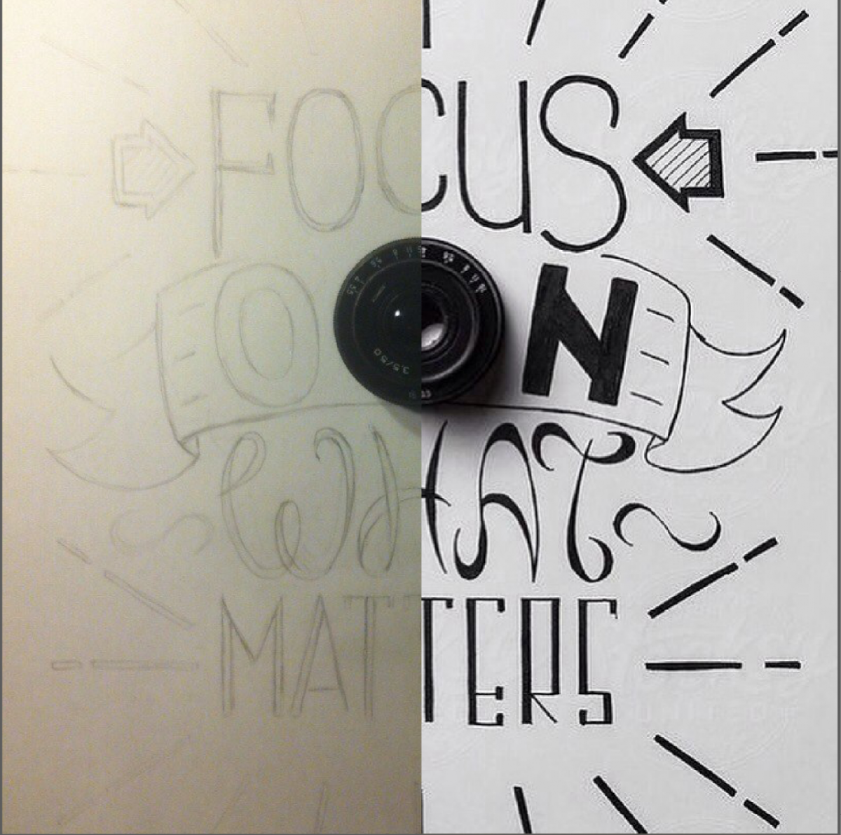
As for works in the style of lettering, at the stage of "how to implement it" I begin with trying to imagine where the word or phrase will be located. Firstly, the writing must be easy to read, and secondly, the surroundings and the word should be in harmony and complement each other well.


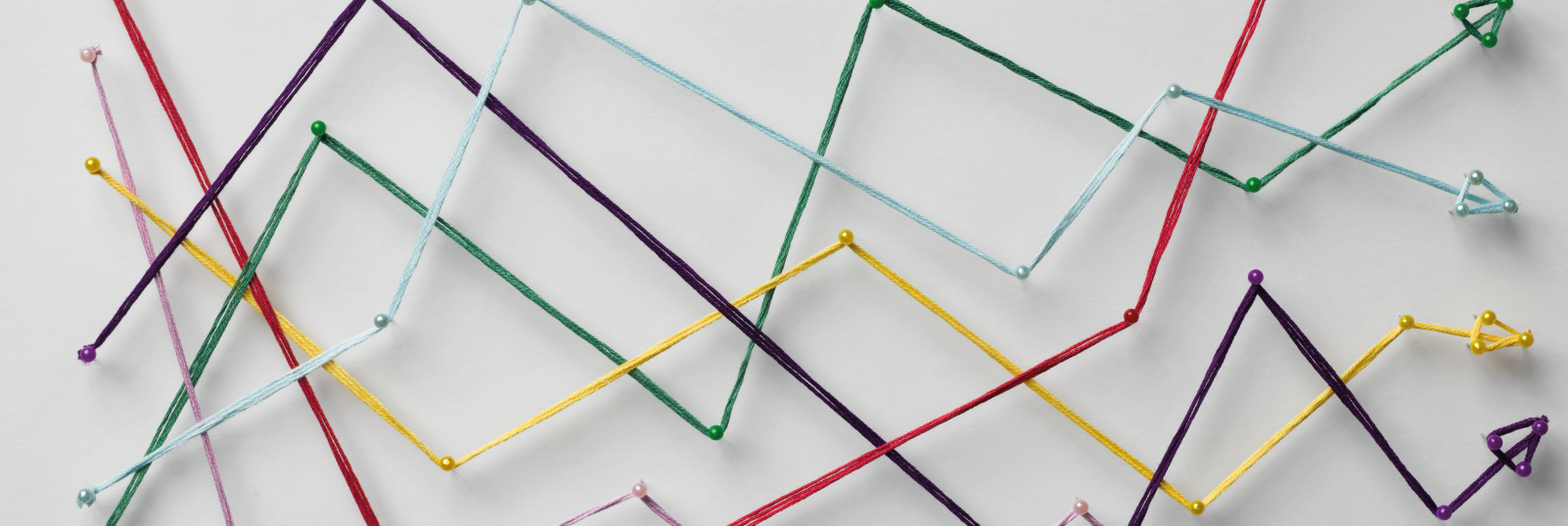
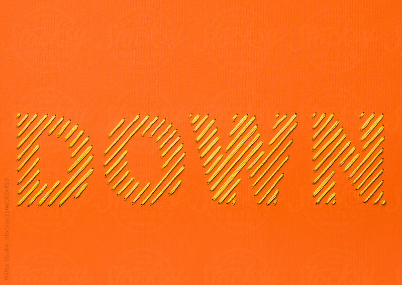
The next stage is thinking about how to realize the idea, what it takes: what objects and on what the composition will be located, what it will be made from and so on. As for lettering, then I look for what the word can be made from. It can be like a stencil cut from paper, or it can be tridimensional from multiple layers, or embroidered with threads, or drawn on some basis. There are a lot of ways and it is necessary to apply the most appropriate for a particular case.
Visual intensification of a composition is also important. This is the things added to the word which it describes, enhances and unifies the whole composition. Below is an example from our portfolio - Autumn sign.

In this composition there are attributes of autumn, which is associated with fallen leaves, a warm blanket and of course, a rich harvest. An important point is the color that corresponds to the time of year - autumn. Intensifying a composition by selecting specific colors is one of the main ways. Color can set the tone for the entire illustration. For example, if you want to convey a peaceful, harmonic condition, an analog color scheme (2-3 colors located next to one another on the color wheel) is used. Complementary colors (opposite colors on the color wheel) make an illustration vivid and more dynamic. In order to use different color techniques it's worth learning how to use the color wheel.
Enhancement of visual perception can also be achieved by inclining the letters (makes the composition more dynamic).
The overall tilt of the composition allows us to strengthen the positive or negative effect of perception.
Writing different words in a composition with different fonts is also a way of making perception easier and it has a positive effect on creating a great visual of your work. Special attention should be paid to such factors as trend and seasonality. I must say that there is not much point to blindly follow trends and rapidly changing fashion in style, color and materials. One day they are popular and the next they are out-of-date, and hence your image cannot be used anywhere, which in its turn means that it won't be bought as much. Seasonality, on the other hand, plays a big role for stocks. For summer you should create summer pictures, and for holidays draw appropriate compositions, whether it's Happy Easter, Valentine's day, Back to school, or many others. The choice of relevant topics for illustration (examples) also gives the best results and more income.
As you have already guessed, before an idea is realized there are many stages of preparation, and only then comes the implementation.
Where can such illustrations be used? Articles, blogs, sites like this kind of "delicious" pictures, so if you are interested in such kind of photography, then it's time to start! The above-described method can be applied to implement any ideas not related to lettering and typography: creation of concepts, photos and more.
Learn, study, try, experiment, be confident in your work and look for interesting ideas and ways to implement them, and everything will turn out great!
Thank you for your attention!
The author - Vladimir Ivankin – Milles graphic designer
Follow us on our social media profiles!
Subscribe to our instagram!
Instagram @mill.es
СохранитьСохранить
YOU MIGHT ALSO LIKE


Vladimir Ivankin
Vladimir has over 9 years experience in Graphic Design. He participated in many creative projects. Now he produces the coolest vector images and hand drawn illustrations for our collection.
 100+ Fans |
 10+ Followers |
 11.000+ Followers |
 10+ Followers |
 10+ Subscribers |
 13 Subscribers |
THANK YOU FOR SUPPORT!
Please, Check your mailbox and confirm your subscription within 24 hours via attached link.
Required