


Jun 22, 2016
“Lettering in photography”
-
Vladimir Ivankin ,
Photostock

Lettering in photography. What is it? And how is it used?
Those, who get down to working with stocks seriously and constantly study them, know that new trends come on and off, whether it's flat style illustrations or line style icons, the same applies to photography, what to shoot and how to shoot. Today I would like to talk about the phenomenon of works in lettering style and their use in stock photography.
Briefly about what lettering is. It is a word or an expression (phrase) written by an author, as it's said “by hand”, meaning that it is a uniquely designed work without the use of somebody else's fonts. This is the case when a designer creates his work from the very beginning: draws the font himself.
What is so remarkable about these works?
The answer is simple - they look impressive and beautiful, standing out against the background of works with ready-made fonts used. After all, the author each time "draws" a word or phrase in new ways and that is what makes this work unique, whether it is used in restaurant menus, shop windows, interior walls of offices, creation of logos and thousands of other ways lettering can be used to create the visual of a product. If you look around, such "hand-made" fonts are all around us, ranging from such giants of industry as Coca - Cola, the logo of which is completely hand-drawn and ending with the label of the American whiskey "Jack Daniels", as well as music album covers, the design of which is based on hand lettering, stylish posters of major events and many other works where the font was drawn by hand. As for the use of lettering on stocks, there are two options: the first is for those dealing with vector graphics; and second, for those who are on good terms with cameras and express their creativity through high-quality images.
So, the first option.
If you make vector graphics and draw for stock sites, there is a huge number of ways you can use lettering. For example, logos for companies: craft bakeries, coffee shops, craft beer breweries, beauty salons, veterinary services and so on. I can tell you that the creation of logos using lettering is already common, but don't forget that it needs to be of high quality and not become a jumble of letters, making it difficult to make out. In other words - watch out for readability, otherwise the logo will cease to perform its main function - to represent the company.
Individual words and expressions, such as: Spring, Summer, Sale, Happy Holidays, Merry Christmas, I love you, thank you, and many other commonly used phrases in everyday life, decorated by your letters, will be used by customers for whatever their needs may be, such as creating greeting cards, captions on photos, spring menu, and much more.
The use of lettering along with an illustration or a separate character gives the opportunity to implement interesting ideas. By inscribing lettering in illustration or vice versa, you will be able to creatively complete them, and hence the demand and sales of these works will be high.
Font. If you are already confident in drawing individual words, it is likely that you will be able to create your own font by drawing each letter separately, and, for example, to sell your set. Alphabets made out of drawn letters are highly valued on stocks, and such works always get in the top. Other designers can use these fonts for their projects.
These are probably the most common uses of lettering in graphic design and illustration. On understanding this area better, you'll be able to find a use for it.
The second way of using lettering is when you are a photographer and you are not related to graphic design in any way. Perhaps, it is worth noting that at one stage of its development, lettering entered into a new "dimension" of use, stepped from the sheets and ceased to be just letters on paper. Designers decided not to restrain themselves and started creating fonts directly from scrap materials, this trend looks fresh and interesting, allowing you to create more varied solutions in this area, and of course to develop in your favorite business. What more could you ask for?
Let's consider a few examples of how lettering can be implemented in a project, which tools to use and how to photograph your work.
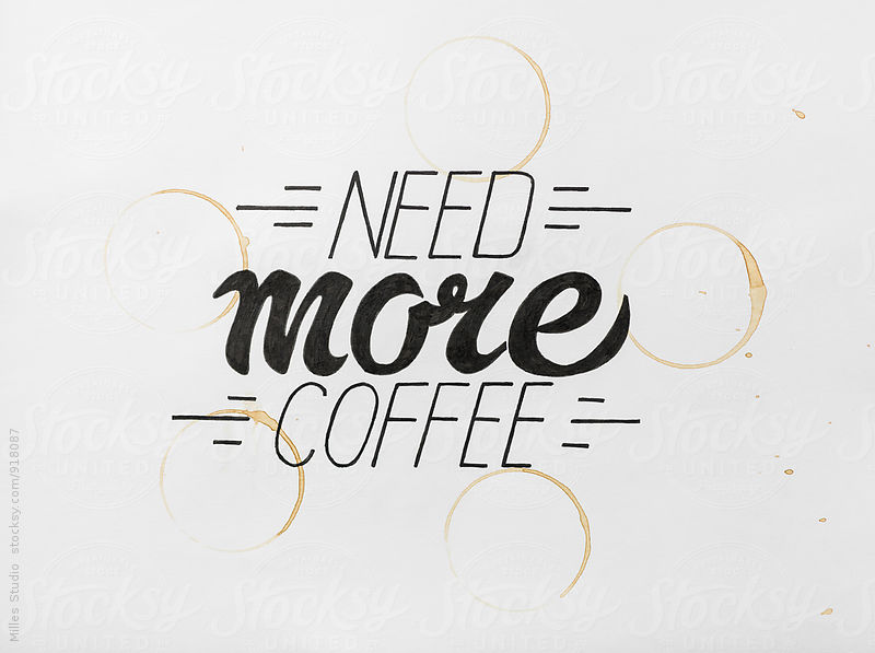
The first, and probably the easiest way is to draw the font using any writing tool on paper. This method is quite simple and in order to implement it, as you probably already guessed, you would need paper and any writing instrument: pen, pencil, marker, etc. Photographing these works is not a difficult thing to do, you can even use natural light and not think much over how to set the light in this shot.
Another option is to cut out the letters on paper.
In this case, the letters are cut on paper and represent a kind of a stencil. In the case when you have to work with paper, the basic tools are: pencil, ruler, cutter and your patience to get it all cut out. Do not forget about the protection of the desk, otherwise, after three or four such projects, the countertop will not say thank you, and will look quite obscene, so better to stock up on non-slip surface for your desk.

For shooting these works it is best to use a light source in order to get the perfect shade that will add volume to your work. A little secret to this photo is that while shooting we lifted the white sheet and due to this we got such an interesting depth of shadows. I have recently discovered that you don't have to cut out letters completely, but you can leave them on a sheet and just fold it a little bit, which in my opinion only made the picture more vivid, and it only benefited from it.
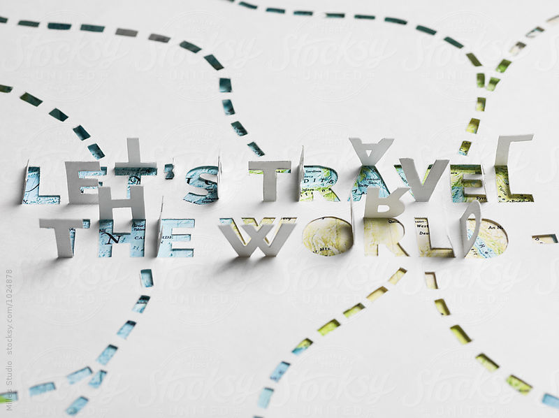
I want to note that to make the task of cutting out inscriptions easier, you can use a cutting plotter. But first you will need to move the sketch into a computer (scan it, for example), then render it in any vector program, and then send it to a print shop for the inscription to be cut. It might not save your time, but you will get a perfectly straight cut lettering.
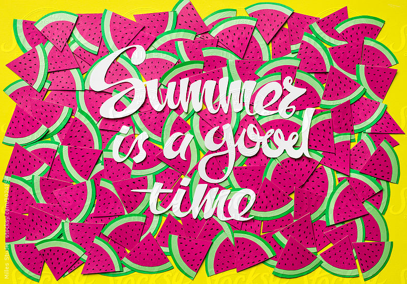
The following method of implementing your ideas with different words is the use of various items in order to get this word. You can act according to whatever your imagination tells you, well, and here are a few examples of our works:


As it has probably become clear already, you can use anything, and the extra tools are needed only if required by a particular idea. You can photograph these works both in natural light and using light sources, depending on the task. Meanwhile, we move on to delicious and edible. Works where spices or chocolate are used (yes, just imagine the letters that you can eat), meat, flowers, dough, jam, generally, everything edible that you come across. Such works also require patience and a full stomach to avoid temptation to eat the letters while you're creating them.


Such pieces are usually quite time-consuming, as the chocolate letters will begin to melt, while you are looking for a memory card for your camera, and your cat will have time to steal a piece of sausage from the letter "M" until you adjust the light. So you should be serious about such photo shoots in order for the result not to disappoint you. And of course, you should not forget that all the food involved in the shooting should be fresh and of excellent appearance, whether it's a watermelon, cantaloupe or cucumbers. A couple of such photo sessions, skill and patience, and you will be pleasantly surprised how great they are, while everyone stays fed and happy, and most importantly, you get good quality photos.
It is worth noting that in this area of lettering in photos, it is not only important what the font is made of, but also the composition design where it is located. For example, if you write the word "chocolate" using chocolate, a nice addition to the composition would be jars with melted chocolate, the molds for letters that you used, spatulas for stirring chocolate. It is also important to choose a background on which the entire composition can be placed, not to mention the fact that the entire arrangement must be set in a correct color. Of course, this is just one example of how an idea can be enjoyed and a photo shoot organized.
We – the Milles team engage in this area - creation of concepts, including the ones with lettering and typography.
Constant experimentation with color and form, objects and space allow us to create stunning images that convey an idea and a concept.
What is required in order to create images that would look great and be sold actively? We get a chance to talk about this in another post, where I tried to lift the veil a little bit of how we approach the process of creating our works, some of which you can see here. Thank you for your attention!
The author - Vladimir Ivankin – Milles graphic designer
Follow us on our social media profiles!
Subscribe to our instagram!
Instagram @mill.es
YOU MIGHT ALSO LIKE

Vladimir Ivankin
Vladimir has over 9 years experience in Graphic Design. He participated in many creative projects. Now he produces the coolest vector images and hand drawn illustrations for our collection.
 100+ Fans |
 10+ Followers |
 11.000+ Followers |
 10+ Followers |
 10+ Subscribers |
 13 Subscribers |
THANK YOU FOR SUPPORT!
Please, Check your mailbox and confirm your subscription within 24 hours via attached link.
Required